CSS
Cascading Style Sheets
Lukáš Bařinka
CSS is a language for describing the rendering of structured documents (such as HTML and XML) on screen, on paper, etc.
Table of contents
- Basic principles
- Syntax
- Selectors
- Inheritance
- Formating (box) model
- Visual formating
- Text
- Generated content
- Media
- Layout
Basic principles
Principles overview
- Extension (enrichment) for structured documents
- Document structure and visual presentation separation
- Forward and backward compatibility
- Platform/device independency
- Maintainability (shareability)
- Simplicity
Principles overview (cont.)
- Traffic efficiency
- Flexibility
- Language richness
- Other languages interoperability
- Accessibility
CSS evolution
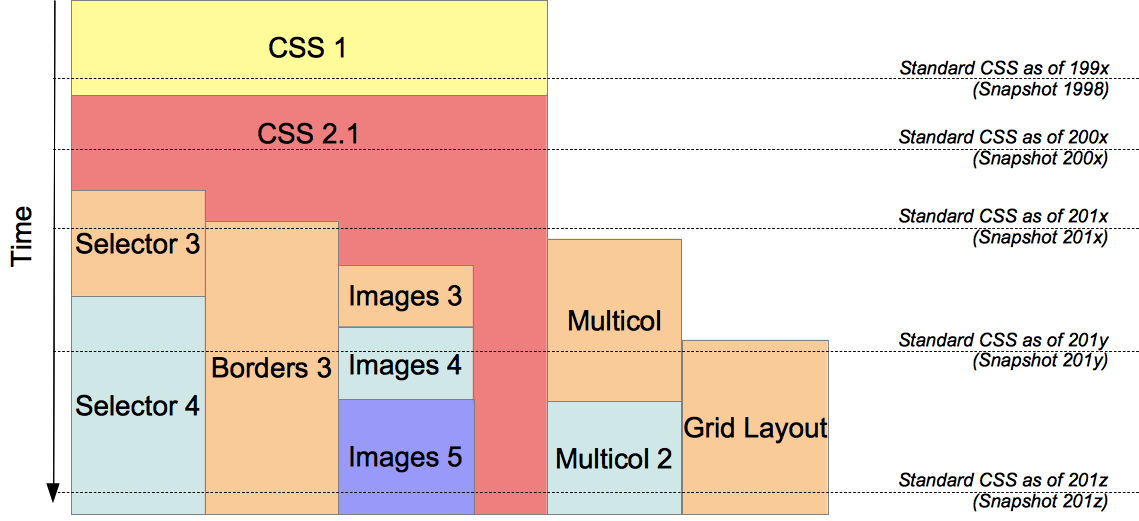 Current work
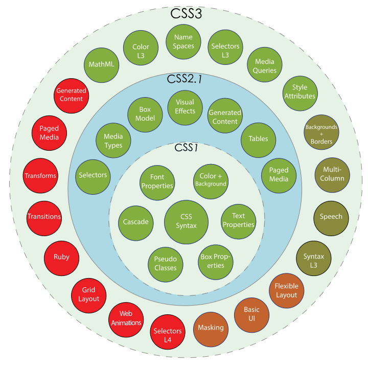
CSS universe
Syntax
Stylesheet syntax
- The stylesheet is a set of rules
- Rules specify look and fell of the document

CSS integration - plain HTML
							<html>
							  <head>
							    <title>Plain HTML</title>
							  </head>
							  <body>
							    <h1>Page Headline</h1>
							    <p>Summary paragraph</p>
							    <p class="motto">Motto paragraph</p>
							    <p id="p123">Normal text paragraph</p>
							  </body>
							</html>
CSS integration - linked CSS
							<html>
							  <head>
							    <title>Linked CSS</title>
							    <link rel="stylesheet" type="text/css"
							          href="http://style.com/cool" title="cool">
							  </head>
							  <body>
							    <h1>Page Headline</h1>
							    <p>Summary paragraph</p>
							    <p class="motto">Motto paragraph</p>
							    <p id="p123">Normal text paragraph</p>
							  </body>
							</html>
CSS integration - imported CSS
							<html>
							  <head>
							    <title>Imported CSS</title>
							    <style type="text/css">
							      @import url("http://style.com/basic");
							    </style>
							  </head>
							  <body>
							    <h1>Page Headline</h1>
							    <p>Summary paragraph</p>
							    <p class="motto">Motto paragraph</p>
							    <p id="p123">Normal text paragraph</p>
							  </body>
							</html>
CSS integration - included CSS
							<html>
							  <head>
							    <title>Included CSS</title>
							    <style type="text/css">
							      h1 { color: blue }
							      p.motto { color: yellow }
							      #p123 { color: green }
							    </style>
							  </head>
							  <body>
							    <h1>Page Headline</h1>
							    <p>Summary paragraph</p>
							    <p class="motto">Motto paragraph</p>
							    <p id="p123">Normal text paragraph</p>
							  </body>
							</html>
CSS integration - inline CSS
							<html>
							  <head>
							    <title>Inline CSS</title>
							  </head>
							  <body>
							    <h1>Page Headline</h1>
							    <p style="color: red">Summary paragraph</p>
							    <p class="motto">Motto paragraph</p>
							    <p id="p123">Normal text paragraph</p>
							  </body>
							</html>
CSS integration - overview
							<html>
							  <head>
							    <title>Inline CSS</title>
							    <link rel="stylesheet" type="text/css"
							          href="http://style.com/cool" title="cool">
							    <style type="text/css">
							      @import url("http://style.com/basic");
							      h1 { color: blue }
							      .motto { color: yellow }
							      #p123 { color: green }
							    </style>
							  </head>
							  <body>
							    <h1>Page Headline</h1>
							    <p style="color: red">Summary paragraph</p>
							    <p class="motto">Motto paragraph</p>
							    <p id="p123">Normal text paragraph</p>
							  </body>
							</html>
Syntax features
- Case insensitive (except outer parts - selectors)
- Keywords (
red) Vs. Strings ("red") - Block of rules in
{ } - Properties/values in declaration separated by
; - Comments inside
/* */(HTML comment tags<!-- -->allowed, but do not delimit CSS comment) - Encoding in CSS:
@charset "ISO-8859-2"
Syntax features - grouping
							h1 { color: red }
							h2 { color: red }
							h1, h2 { color: red }
							h1 { font-size: 12pt }
							h1 { font-weight: bold }
							h1 { font-family: "Helvetica" }
							h1 { font: bold 12pt "Helvetica" }
Values - lengths
- Relative - Child elements inherit computed value
em- font sizerem- root element font sizeex- height of letter "x"%- of parent valuevw/vh/vmin/vmax- 1% of viewport width/height
Values - lengths
- Absolute
px- pixel / visual angle unit (1/96 in)in, cm, mmpt- typographical point (1/72 in)pc- pica (12 pt)
Values - URI
- Relative
url("img.jpg")- Absolute
url("https://example.com/file")- Local (fonts)
local("Gentium Bold")
Values - colors
- Keyword
red- RGB value
#f00- RRGGBB value
#ff0000- Function
rgb(), rgba(), hsl(), hsla()
Values - text

- String
"Helvetica"- Keyword
serifsans-serifmonospacecursivefantasy
Values - functions
- Colors
rgb(255,0,0) / rgb(100%,0%,0%) / rgba()hsl() / hsla()- URI
url()- Computed value
calc(50% - 2em)- Attribute reference
attr(href)- Couters
counter(h)
Selectors
CSS1 selectors
E | Type |
E F | Descendant |
.class | Class |
#id | ID |
:link | Link history pseudo-class |
:active | User action pseudo-class |
CSS2 selectors
* | Universal |
E > F | Child |
E + F | Adjacent sibling |
:first-child | Structural pseudo-element |
:hover | User action pseudo-class |
:lang(en) | Lang pseudo-class |
[attribute] | Attribute |
Selectors example

CSS2 pseudo-element vs. pseudo-class
- Pseudo-elements
:first-child:first-line, :first-letter:before, :after- User action pseudo-classes (exclusive)
:link, :visited:hover, :focus- Paged media pseudo-classes
@page :first@page :left, :right
CSS3 selectors
- Subsequent-sibling / Target
E ~ F:target- Structural pseudo-classes
:root, :empty:last-child, :last-of-type:nth-child(n), nth-of-type(n):nth-last-child(n), nth-last-of-type(n):only-child, :only-of-type- User action/UI pseudo-classes
:enabled, :disabled, :checked- Negative pseudo-class
:not(s)
CSS2 attribute selectors
[attr] | Any value |
[attr="val"] | Exact value |
[attr~="val"] | Exact value in space-separated list |
[attr|="val"] | Beginning value in hyphen-separated list e.g. "en-US" |
CSS3 attribute selectors
[attr^="val"] | Begins with |
[attr$="val"] | Ends with |
[attr*="val"] | Contains substring |
Inheritance
Value sources (defaulting)
- Value as result of cascade (rules)
- Else inherited value (from parent)
- Else initial value
Some values are inherited, some values don't
							body {
							  color: black;        /* value inherits */
							  background: white;   /* value does not inherit */
							}
							p {
							  background: inherit; /* 'inherit' value */
							}
Style origins
- Author origin (stylesheet)
- User origin (settings)
- UA origin (user-agent) – e.g. web browser
- Animation origin
- Transition origin
Declaration importance
[hidden] {

							display: none !important;

						}
Cascading order
- Filter all declarations for the element/propertyfor the target media type
- Sort by importance (!) and originUA < user < author < anim. < author ! < user ! < UA ! < trans.
- Sort by specificity of selector(more specific selectors precede more general ones)
- Sort by order of appearance(latter specified is used)
Inheritance computation
| a | style atribute |
| b | ID atribute count |
| c | others atribute and pseudo-class count |
| d | pseudo-/element's name count |
a → b → c → d
Inheritance computation example
							*               /* a=0 b=0 c=0 d=0 */
							li                          /* a=0 b=0 c=0 d=1 */
							li:first-line    /* a=0 b=0 c=0 d=2 */
							ul li                    /* a=0 b=0 c=0 d=2 */
							ul li+li              /* a=0 b=0 c=0 d=3 */
							h1 + *[rel=up]  /* a=0 b=0 c=1 d=1 */
							ul ol li.red      /* a=0 b=0 c=1 d=3 */
							li.red.level      /* a=0 b=0 c=2 d=1 */
							#x34y                    /* a=0 b=1 c=0 d=0 */
							style=""              /* a=1 b=0 c=0 d=0 */
Value processing
| 1. Declared value | Filtered values from rules |
| 2. Cascaded value | Winning value of cascade |
| 3. Specified value | Winning or defaul value |
| 4. Computed value | Absolute value (inherit) |
| 5. Used value | Real values (e.g. auto) |
| 6. Actual value | Adjust value (e.g. round) |
Inherit, remove and reset values
• initial• inherit• unset
- Reset all properties
all: initial | inherit | unset
Box model
Box model overview

Collapsing margins

Borders
border-width- length | thin | medium | thick
border-color- color | transparent
border-style- none | hidden | dotted | dashed | solid | ...
border- border-width border-style border-color
h1 { border: thin solid sliver }
Edges
- margin-*, padding-*, border-*
- border-*-width, border-*-color, border-*-style
- top | right | bottom | left

- values{1,4}
- thin
- thin thick
- thin thick medium
- thin thick medium .1em
Color and background
color:- color
background-color:- color | transparent
background:- [ background-color || background-image || background-repeat || background-attachment || background-position ]
Background image

background-image:- uri | none
background-repeat:- repeat | norepeat |
repeat-x | repeat-y
background-attachment:- scroll | fixed
background-position:- [ [ percentage | length | left | center | right ]
- [ percentage | length | top | center | bottom ]? ]
- [ [ left | center | right ] || [ top | center | bottom ] ]
background-image:background-repeat:repeat-x | repeat-y
background-attachment:background-position:CSS3 Background
- Multiple background images
- Comma separated values in properties
- Excess values at the end
- Repeat values if not enough
							background-image: url(flower.png), url(ball.png), url(grass.png);
							background-position: center center, 20% 80%, top left, bottom right;
							background-origin: border-box, content-box;
							background-repeat: no-repeat;
background-clip:background-origin:- border-box | padding-box | content-box
background-size:- [ length-percentage | auto ]{1,2} | cover | contain
Box shadow
- One or more drop-shadows
- Comma-separated list of shadows,
ordered front to back
box-shadow:- none | color? && length{2,4} && inset?
- (horizontal offset, vertical offset,
blur radius, spread distance)
Box shadow example

							width: 100px; height: 100px;
							border: 12px solid blue; background-color: orange;
							border-top-left-radius: 60px 90px;
							border-bottom-right-radius: 60px 90px;
							box-shadow: 64px 64px 12px 40px rgba(0,0,0,0.4),
							12px 12px 0px 8px rgba(0,0,0,0.4) inset;
CSS3 Border
border-radius:- len-perc{1,4} [ / len-perc{1,4} ]?
border-image-source:- none | image
border-image-slice:- [ number | percentage ]{1,4} && fill?
border-image-width:- [ length-percentage | number | auto ]{1,4}
border-image-outset:- [ length | number ]{1,4}
border-image-repeat:- [ stretch | repeat | round | space ]{1,2}
Visual formating
Display property

blockinline-blockinlinelist-itemnone
tableinline-tabletable-row-grouptable-columntable-column-grouptable-header-grouptable-footer-grouptable-rowtable-celltable-caption
Positioning schemes

- In-flow
- Normal flow
position: static
position: relative
- Out-of-flow
- Absolute positioning
position: absolute
position: fixed - Floats (h-shift)
float: ...
clear: ...
Box offsets
- For elements with
position ≠ static - Distance between absolutely positioned box and containing block
- Offset of relative box with respect to given (static) position
top | right | bottom | left:- length | percentage | auto
Floats
- Box shifted to the left or right of current line
- Float touches containing blok edge or edge of another float
- Content may flow along its side
float:- left | right | none
clear:- left | right | both | none
Float examples

Layered presentation
- Stacking context
- Boxes with the same slack level are
ordered by tree order
z-index:- integer = stack level (new context)
- auto = stack level is 0
Containing block

Visual effects
visibility:- visible | hidden | collapse
overflow:- visible | hidden | scroll | auto
clip:- rect(top, right, bottom, left) | auto
Content width
- Not applied to
inlineelements,
table rows and row groups - Negative values are illegal
width:- length | percentage | auto
min-width:- length | percentage
max-width:- length | percentage | none
Content height
- Not applied to
inlineelements,
table columns and column groups - Negative values are illegal
height:- length | percentage | auto
min-height:- length | percentage
max-height:- length | percentage | none
Line height
line-height:- normal | number | length | percentage
vertical-align:- baseline | sub | super | top | text-top | middle | bottom | text-bottom |
percentage | length
Vertical align overview

Text
Text align
text-align:- left | right | center | justify
text-align-last:- auto | left | right | center | justify
text-indent:- length | percentage
Text decoration
- Rendered only on text
- Including white-spaces, letter/word spacing
- Margin, borders, and paddings are skipped
text-decoration- none |
underline | overline | line-through | blink
Spacing
letter-spacing:word-spacing:- normal | length
-
white-space- WS = collapse sequences of white-spaces
- wrap = break line to fill line box
- NL = break at new line character
normal= ✓ WS, ✓ wrappre= ✗ WS, ✗ wrap, ✓ NLnowrap= ✓ WS, ✗ wrappre-wrap= ✗ WS, ✓ wrap, ✓ NLpre-line= ✓ WS, ✓ wrap, ✓ NL
Capitalization
text-transform:- capitalize = ↑ First Character Of Each Word
- uppercase = ↑ ALL CHARACTERS
- lowercase = ↓ all characters
- none
Fonts
font-family:- ( family-name | generic-family )+ separated by ,
font-style:- normal | italic | oblique
font-variant:- normal | small-caps
font-weight:- normal | bold | bolder | lighter | [1-9]00
font-size:- absolute: xx-small | x-small | small | medium | large |
x-large | xx-large - relative: larger | smaller
- length | percentage
Shorthand font property
font:- [ font-style || font-variant || font-weight ]?
- font-size [ / line-height ]?
- font-family |
- caption | icon | menu | message-box |
small-caption | status-bar
Font examples
						p { font: 12px/14px sans-serif }
						p { font: 80% sans-serif }
						p { font: x-large/110% "New Century Schoolbook", serif }
						p { font: bold italic large Palatino, serif }
						p { font: normal small-caps 120%/120% fantasy }
Font resources
@font-face {- font-family: "New Font Name";
- src: url(ideal-sans-serif.woff2) format("woff2"),
- url(good-sans-serif.woff) format("woff"),
- url(basic-sans-serif.ttf) format("opentype");
}
Line breaking
word-break:- normal | keep-all | break-all | break-word
line-break:- auto | loose | normal | strict | anywhere
hyphens:- none | manual | auto
Mechanisms of content generation
contentproperty of:beforepseudo-elements:afterpseudo-elements
- Elements with
display: list-item
p.note:before { content: "Note: " } /* \A = line break */
Content property
none | not generated |
normal | 'none' for :before/:after |
string | text content |
uri | external resource (e.g. image) |
counter | counter content |
open-quote | string from 'quotes' property |
no-open-quote | no content, changes level of nesting |
attr() | string value of attribute |
Quotation marks
- The first (leftmost) pair represents the outermost level of quotation
quotes:- none
- [ string string ]+
							q:lang(no) { quotes: "«" "»" '"' '"' }
							q:before   { content: open-quote }
							q:after     { content: close-quote }

							<p><q>Trøndere gråter når <q>Vinsjan på kaia</q> blir deklamert.</q>

							«Trøndere gråter når "Vinsjan på kaia" blir deklamert.»
Automatic counters and numbering
counter-reset:counter-increment:- [ identifier integer? ]+ | none
							body { counter-reset: chapter; }
							h1:before {
							  content: "Chapter " counter(chapter) ". ";
							  counter-increment: chapter;
							}
							h1 { counter-reset: section; }
							h2:before {
							  content: counter(chapter) "." counter(section) " ";
							  counter-increment: section;
							}
Counter nesting and scope
- Counters are "self-nesting"
- Resetting a counter in a descendant (pseudo-)element creates a new instance
							ol { counter-reset: item }
							li { display: block }
							li:before { content: counters(item, ".") " "; counter-increment: item }
Counter styles
counter(name)- Default: decimal numbers
counter(name list-style-type)- ↓
Lists
list-style-type:- disc | circle | square | decimal | decimal-leading-zero | lower-roman | upper-roman | lower-greek | lower-latin | upper-latin | armenian | georgian | lower-alpha | upper-alpha | none
list-style-image:- uri | none

list-style-position:- inside | outside
list-style:- [ list-style-type || list-style-position || list-style-image ]
Media
Mechanism to support media-dependent style sheets
							<link rel="stylesheet" type="text/css" media="screen" href="style.css">
							<link rel="stylesheet" type="text/css" media="print" href="print.css">
							@media screen {
  						  * { font-family: sans-serif }
							}
							@import "print-styles.css" print;
							<link media="screen and (color), projection and (color)"
							      rel="stylesheet" href="example.css">
							<link media="screen and (color), projection and (color)"
							      rel="stylesheet" href="example.css" />
							<?xml-stylesheet media="screen and (color), projection and (color)"
							      rel="stylesheet" href="example.css" ?>

							@import url(example.css) screen and (color), projection and (color);
							@media screen and (color), projection and (color) { … }
Media types
@media media-list { rule-set }
all | all devices |
screen | color computer screen |
print | paged media/print preview |
braille | braille tactile feedback devices |
embossed | paged braille printer |
handheld | typically small screen, limited bandwidth |
projection | presentation, paged media |
speech | speech synthesizer |
tty | fixed-pitch character grid (no px) |
tv | typically low resolution, color, limited-scrollability, audio |
Media features
min-*= greater or equalmax-*= smaller or equal- Can be used without value
width, device-widthheight, device-height- length
orientation- portrait | landscape
aspect-ratio, device-aspect-ratio- ratio (e.g.
16/9)
Media features (cont.)
color, color-index, monochrome- integer
resolution- resolution (e.g.
300dpi, 118dpcm) grid- integer
Media queries level 4 features
overflow-block- none | scroll | paged
overflow-inline- none | scroll
(any-)pointer= any/primary device- none | coarse | fine
(any-)hover= any/primary device- none | hover
Media query operators
, | media-type , media-type |
and | media-type and (media-feature) |
not | not media-type |
only | only media-type |
New layout models
Multi-column layout

columnscolumn-widthcolumn-countcolumn-gapcolumn-rulecolumn-spancolumn-fill
Layouts

Flexible box layout
- Content-based
- 1D (single-axis-oriented)
- Bottom-top
Grid layout
- Container-based
- 2D
- Top-bottom
Flexbox layout

display:- flex | inline-flex
flex-direction:- row | row-reverse | column | column-reverse
flex-wrap:- nowrap | wrap | wrap-reverse
Flexbox overview
- Direction
- flex-direction
- flex-wrap
- flex-flow
- order
- Alignmnet
- justify-content
- align-items
- align-content
- align-self
- Size
- flex-grow
- flex-shrink
- flex-basis
- flex
- Container
- Item
Grid layout

display:- grid | inline-grid
grid-template-rows:grid-template-columns:- [name] width/height
- repeat(count, length)
grid-column:grid-row:- span line
grid-template-areas:- areas...
grid-area:- area-name